
The story of the Dover Residency and its Logo
Dover Residency
The Dover Residency logo has been designed by me, Rachel Sale. Here’s a story about the design and the residency itself.
I was introduced to Joanna Jones last winter, by my uncle James Burn, who has known Joanna for most of his life. He thought we might get on because we both run artist led art organisations in the places that we live: Joanna, as you know, runs DAD and I run F.A.T. Studio, which operates from a small shop on Old Kent Road, SE London. James brought me to Dover and he was right, Joanna and I clicked instantly. We both care deeply about our neighbourhoods and we both love art, especially for its power to bring people closer to themselves and to each other.
At first, I was bowled over by the majesty of 7 Victoria Park, but thanks to good conversation, I quickly felt right at home in the Urban Room with Joanna and artist Simon Bill another DAD Co director. When it was time to go home, I was already longing to come back. So, when I found myself on a Zoom call with Joanna a few weeks later and she was inviting me to help set up a residency project on the top floor of her house (the space that used to be her studio before she moved it to the ground floor ) – I was delighted and gave her an INSTANT YES.
Over the last few months we’ve been meeting up to scope out the plan for the Dover Residency. We’ve hashed out the aims, applied for funding, written invitations and pulled together lists and information for future residents. One of the things on my to-do list was to design the logo for the project, and I had something in mind ……
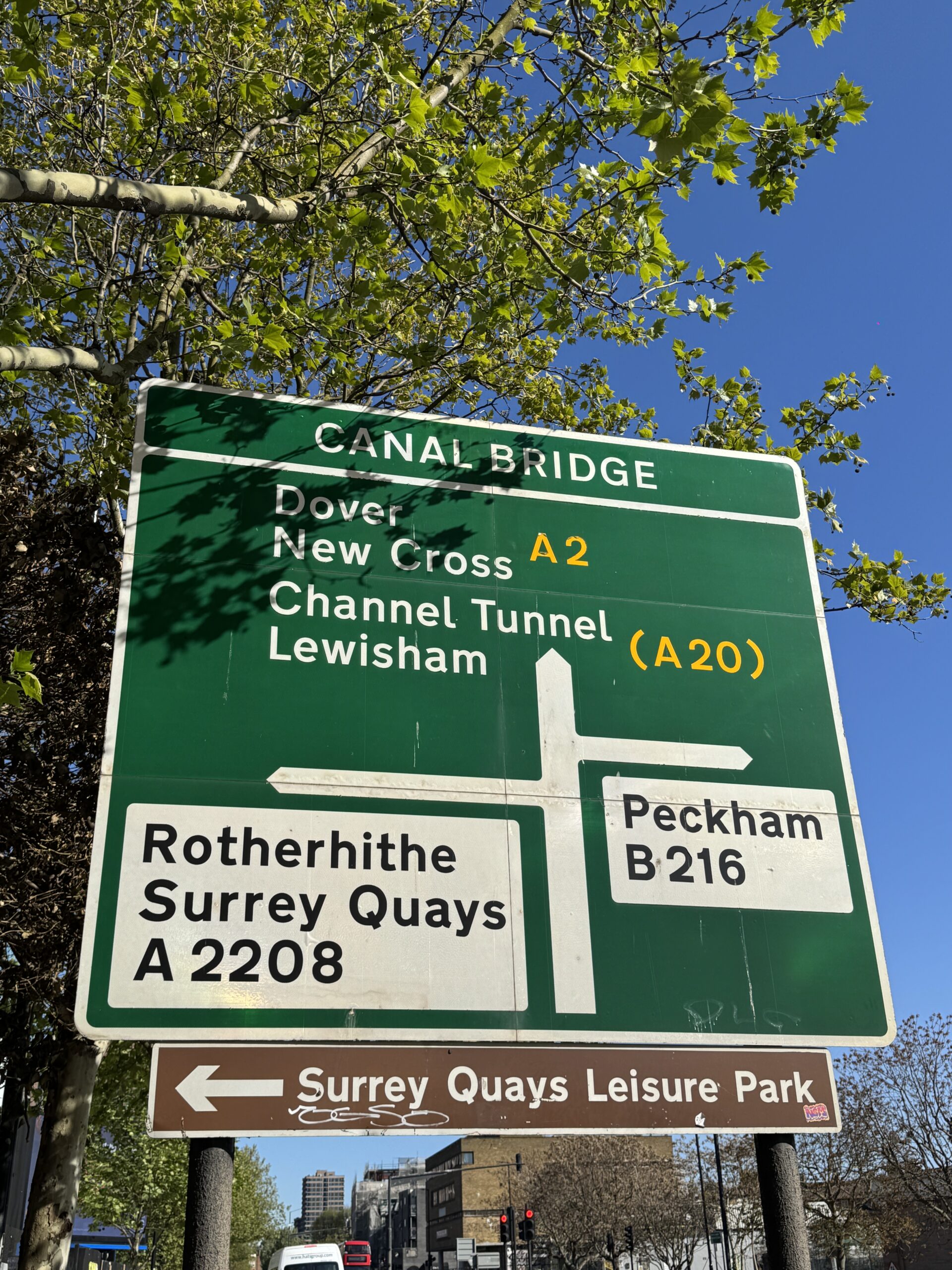
When you step out of F.A.T. Studio on Old Kent Road, the first big road sign you see points you out of London, along the A2, to Dover. With the residency project in mind, it was thrilling to look at this sign, which now felt so clear in its message (get out of London, go find Dover!), so it became the key reference for the logo. I traced and reworked the beautiful “Transport” typeface (designed by the legend Margaret Calvert) so that it read Dover Residency. And I lifted the road lines from the photo, painting them DAD yellow as I went.
I liked the way it still felt like a familiar road sign, but I also liked how the lines, taken out of their original context, started to resemble those wooden signposts that you might see while roaming the English countryside – the symbolism of this seemed to chime well with the spirit of the project.